habitacasa real estate

introduction

We present the new brand identity of Habitacasa Inmobiliarias with an exciting and modern transformation, marking a bold step into a new era of its visual identity. This design reflects a fresh and contemporary vision of what the company represents, moving away from its previous gray-toned logo featuring a key inside a house and embracing a warmer, more inviting approach.

The new Habitacasa Inmobiliarias logo is defined by its elegant lettering and rounded shapes, adding a touch of softness and friendliness. The choice of blue and white not only conveys freshness and clarity but also evokes a sense of trust and professionalism—two essential qualities in the real estate industry. A particularly distinctive feature of this new logo is the incorporation of a house roof over the letters "AB" in the name. This clever and creative detail symbolizes the company's core mission: helping people find the home of their dreams. The roof element not only reinforces the idea of "home" but also adds a unique visual component that makes the brand stand out.

The company has embraced a fresher and more appealing image that better reflects its commitment to making the home-buying journey a warm and fulfilling experience for its clients. Without a doubt, this new logo represents a real estate agency looking toward the future with a clear vision and an open invitation to all those in search of a home.

Branding and identity

Websites and digital platforms

Content strategy for social media

the process

Pictogram

Development of a pictogram that complements the lettering and reinforces the brand’s message, making it more recognizable. This roof-shaped pictogram symbolizes many of the brand’s key attributes: home, security, progress, growth, and innovation.


Lettering

Design of a new typography for the visual identity with rounded shapes, making it more appealing to customers. The use of lowercase letters and the preservation of the color palette enhance visual recognition and strengthen the connection between the brand and its audience


Subname

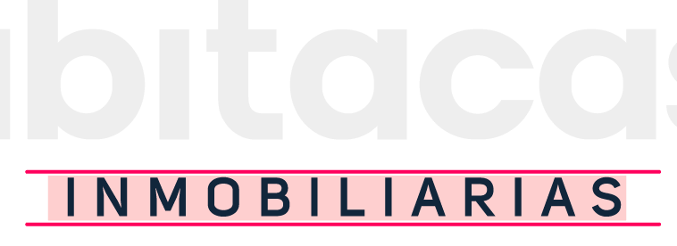
Incorporation of a secondary name in the main brand option, allowing it to be included or omitted as needed. We aimed for a versatile brand identity that maintains the same strong impact on customers, whether the secondary name is present or not, ensuring consistent recognition.


Colour Palette

A new broad-spectrum color palette gives the brand a cutting-edge style with a more appealing look. The primary color, cyan, symbolizes tranquility and relaxation while also giving the brand a youthful and modern character.


the brand

Main Application - White Background

Main Application - Dark Background

Alternative - White Background

Alternative - Dark Background

aplications